Introduction
Colour is more than just an aesthetic choice—it has a profound impact on mood, emotions, and energy. Whether you’re designing a luxury home for sale, decorating an exclusive high-end apartment, or revamping a global luxury estate, choosing the right colours can enhance well-being, productivity, and relaxation.
Luxury property specialists carefully curate colour schemes that evoke elegance, warmth, and sophistication. The right shade can make a room feel larger, cozier, or more inviting, influencing both the homeowner’s experience and the property’s appeal to potential buyers.
In this guide, we’ll explore:
✅ The psychological effects of different colours
✅ Best colour choices for each room
✅ How colour enhances luxury home interiors
✅ Top colour trends in international luxury properties
By the end, you’ll have a complete understanding of how to choose the perfect shades for your home—whether it’s a minimalist retreat, a grand luxury villa, or an upscale city penthouse.
The Psychology of Colours: How Colours Influence Mood and Perception
Different colours trigger different emotions and reactions, making it essential to choose the right shades for different spaces.
Warm Colours: Energising and Inviting
🔴 Red – Passion, warmth, and power. Ideal for dining rooms and entertainment areas.
🟠 Orange – Creativity, enthusiasm, and excitement. Great for home offices or exercise rooms.
🟡 Yellow – Happiness, positivity, and energy. Works well in kitchens, hallways, and sunlit spaces.
Cool Colours: Calming and Relaxing
🔵 Blue – Tranquility, focus, and peace. Perfect for bedrooms, bathrooms, and workspaces.
🟢 Green – Nature, balance, and renewal. Enhances living rooms, offices, and outdoor spaces.
🟣 Purple – Luxury, mystery, and creativity. Adds depth to bedrooms, lounges, and statement walls.
Neutral Colours: Timeless and Elegant
⚪ White – Clean, fresh, and open. Common in minimalist luxury apartments.
⚫ Black – Sophisticated, bold, and dramatic. Used in high-end modern interiors.
🩶 Grey – Subtle, balanced, and versatile. A staple in global luxury estates.
Understanding colour psychology ensures that each room’s palette complements its purpose and enhances the overall atmosphere.

Best Colours for Different Rooms in Luxury Homes
Every room has a unique function, and the colour you choose should enhance the experience of the space.
1. Living Room: The Heart of the Home
The living room is where homeowners relax, entertain, and spend time with family. The colour scheme should promote warmth and elegance.
✅ Recommended Colours:
✔ Neutral Tones – Beige, warm grey, and off-white for a timeless and inviting feel.
✔ Deep Blues & Greens – Adds a touch of luxury and sophistication.
✔ Soft Gold & Champagne – Enhances a grand and elegant ambiance.
Luxury homes for sale often feature rich, layered colour palettes, incorporating textures like velvet, marble, and metallic finishes to elevate the space.
2. Kitchen: A Space for Energy and Creativity
The kitchen is one of the most active rooms in a home. A well-chosen colour palette can make it feel welcoming and energised.
✅ Recommended Colours:
✔ Warm Whites & Creams – Keep the space feeling bright and fresh.
✔ Soft Blues & Greens – Promote a calm and balanced atmosphere.
✔ Bold Black & Gold Accents – Found in luxury property investments, adding a high-end modern touch.
For luxury kitchens, designers recommend matte black cabinetry, brass hardware, and marble countertops for a sophisticated yet functional aesthetic.
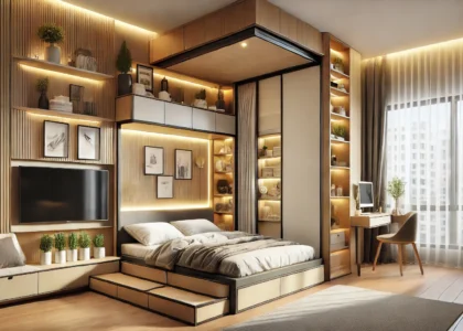
3. Bedroom: A Sanctuary for Rest and Relaxation
The bedroom should be a peaceful retreat that promotes calmness and restfulness.
✅ Recommended Colours:
✔ Soft Greys & Cool Blues – Encourage relaxation and better sleep.
✔ Muted Greens & Earth Tones – Bring serenity and a connection to nature.
✔ Lavender & Blush Tones – Subtle hues for a romantic and elegant feel.
High-end property listings now include spa-inspired master suites, using soft, neutral tones and layered lighting to create a tranquil escape from the outside world.
4. Bathroom: A Spa-Like Escape
Luxury bathrooms should feel serene, clean, and indulgent, mirroring high-end hotel spas.
✅ Recommended Colours:
✔ Crisp White & Soft Greys – Classic and timeless, creating a spa-like environment.
✔ Deep Emerald Green & Navy Blue – Adds depth and sophistication.
✔ Marble-Inspired Neutrals – Found in international luxury properties, enhancing elegance.
Luxury property consultants recommend natural stone, ambient lighting, and minimalist design elements for a relaxing yet luxurious bathroom.
5. Home Office: Enhancing Productivity and Focus
A home office should be a place where concentration and inspiration thrive.
✅ Recommended Colours:
✔ Muted Blues & Deep Greens – Enhance focus and productivity.
✔ Warm Neutrals & Earthy Tones – Create a grounded and inviting atmosphere.
✔ Burgundy & Charcoal Grey – Used in high-end property listings, adding a sophisticated executive feel.
Luxury home offices often feature built-in bookshelves, rich wood finishes, and sleek minimalist furniture, blending functionality with opulence.
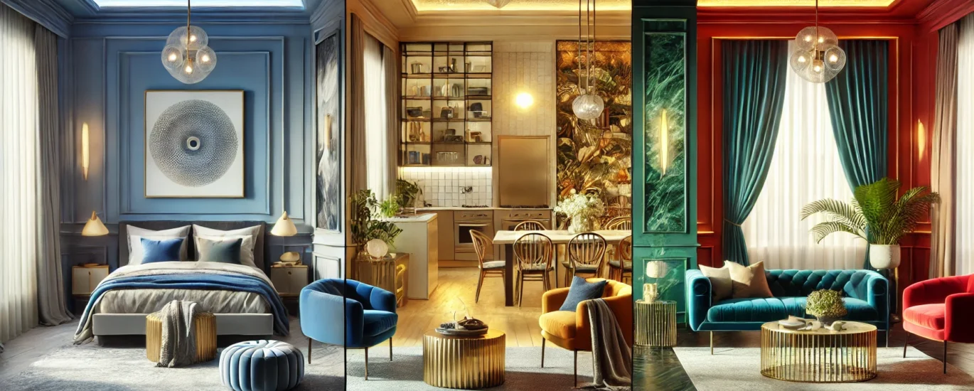
Colour Trends in Global Luxury Estates
Design trends evolve, and 2025’s luxury real estate market is embracing new, bold colour choices.
Trending Colours in Luxury Homes
🔹 Rich Jewel Tones – Emerald green, sapphire blue, and ruby red for dramatic, opulent interiors.
🔹 Earthy Neutrals – Beige, taupe, and terracotta for a warm, sophisticated look.
🔹 Monochrome Palettes – A blend of black, white, and grey for a timeless, modern feel.
🔹 Soft Pastels – Muted pinks, blues, and lavenders creating calm and airy spaces.
Luxury property investments are now incorporating colour psychology in design choices, ensuring that homes feel both visually appealing and emotionally balanced.

How to Choose the Right Colours for Your Home
If you’re unsure about which colours to choose, follow these simple steps:
1️⃣ Consider the Purpose of the Room – Is it for relaxation, socialising, or work?
2️⃣ Think About Lighting – Natural light enhances warm tones, while artificial lighting works well with cool colours.
3️⃣ Use Accent Colours Strategically – Add depth with bold accent walls, statement furniture, or decorative accessories.
4️⃣ Test Before Committing – Paint small sections of the wall before finalising a colour scheme.
5️⃣ Stay True to Your Style – Whether you prefer minimalist, modern, or classic elegance, choose shades that reflect your taste.
For luxury real estate listings, designers often layer different shades, textures, and materials to create a harmonious and high-end atmosphere.
Conclusion
Colour plays a powerful role in shaping the atmosphere of a home. Whether you prefer bold, luxurious hues or soft, calming tones, choosing the right shades can transform any space into a masterpiece.
From tranquil blues in bedrooms to energising yellows in kitchens, understanding colour psychology ensures that your home is both visually stunning and emotionally enriching.
For those looking at luxury property investments, carefully curated colour palettes can increase property value, enhance ambiance, and elevate everyday living.
FAQs
- Which colour is best for luxury interiors?
- Jewel tones like emerald, navy, and gold accents add richness and sophistication.
- What colours make a room look bigger?
- Light neutrals like white, beige, and soft grey create an open, airy feel.
- Can colour affect mood?
- Yes! Warm colours energise, while cool tones promote relaxation.
- What are the best colours for a minimalist home?
- White, grey, taupe, and soft pastels keep interiors clean and elegant.
- How do I add colour without overwhelming my home?
- Use bold accent pieces, statement furniture, or feature walls.